September will be challenging, and many questions remain unanswered: how will the pandemic develop in our country as the days get colder? What will happen to the economy and, above all, to all the professions that are most affected? What can I do for myself to avoid getting caught in this vicious circle of uncertainty and fear?
Read astrologist Monica Kisslings’ comments here: The influence of Mars, the energy planet, will be restricted in September by Saturn, the planet of borders. Therefore: beware and manage your energy carefully. In other words: let go of energy-consuming projects and reload your batteries, preferably outdoors, in the nature. In your home as well, create an energetically powerful environment. Dispose of what disturbs and above all: play with powerful colours! Colours have a strongly stimulating effect and therefore, in September, your habitats could also be rearranged with new colours.
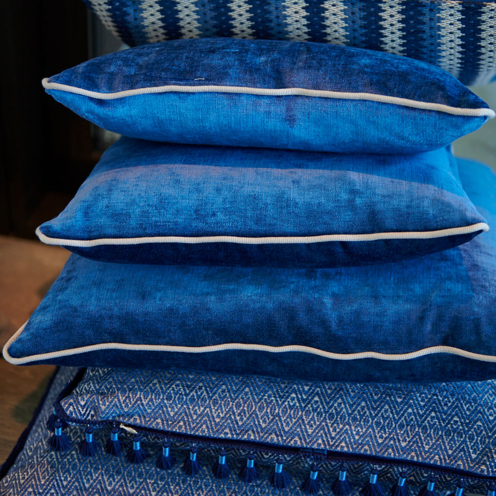
Colours are a powerful factor to energetically support us in difficult times. Red, for example, boost both clothing and surroundings because it stands for fire, embers, passion, vitality. Orange is also very powerful; in colour psychology it represents extravagance, vigour and transformation. As in September, the days become shorter and sometimes duller, give yourself energy kick with strong and powerful colours: vibrant red, intense orange, lively yellow, fresh green and calming blue!
![]() ALLOW YOURSELF SOME COLOUR SHOTS!
ALLOW YOURSELF SOME COLOUR SHOTS!![]()
GO INTERIORS GmbH
Colours brings energy kicks!
How and where to start?
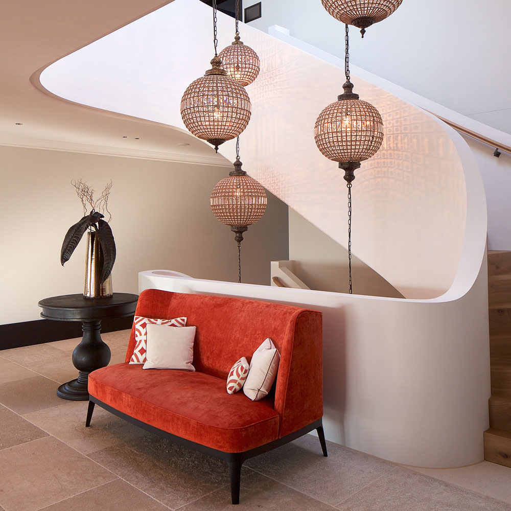
Colours make the difference! Strong colours are statements. However, on walls, muted tones are more suitable than vibrant ones (muted tones have a white or a grey component) because otherwise they could dominate a room. Also, use colour as a general concept, meaning that if you choose a main colour on a wall, it should be repeated in accessories, cushions, vases or pictures to harmonise with the overall picture. Darker colours function better on walls that capture a lot of light, lighter ones, in shady areas. Just try to follow this basic principle: no powerful colours at outer edges or corners, but only within wall interfaces. Why? Because otherwise, the wall will seem like a separating element in the room.
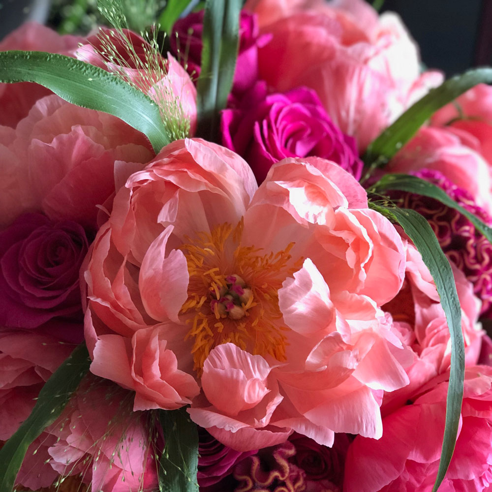
You don’t want to bother by painting entire walls? Then buy yourself some intense coloured flowers. They will enhance any ambience and are pure joy for the eye and the soul. Place them in a vase of a dazzling tone et voilà: you’ve made you individual colour statement!

Interior Designer VSI.ASAI.
Wellbeing Ambassador
aka Madame Etoile
Astrologist
Link to the monthly newsletter of Monica Kissling


