
You may be familiar with BIO-HACKING or all the LIFE-HACKS from social media? SPACE-HACKING is the science-based approach to designing spaces that sustainably improve your quality of life – whether at home or at work.
For a longer and healthier life.
SPACE-HACK No 2
color curious?

Did you know that the colour RED causes a faster pulse, higher blood pressure, increased skin resistance, faster breathing, more blinks than normal and a reduction in alpha waves? A meeting room in red is probably not a good idea, but the red royal cloak lends power and dignity. Causse 2014
And that time passes more quickly in a room with warm colours such as orange or red? Smets 1969 This would be a challenge for all waiting room planners… The temperature in a red-orange workroom is also estimated to be 3° to 4° Celsius warmer than in a blue-green room. Baughan-Young 2002
And here’s the thing: colours also have an effect on people when their eyes are closed! The skin and retina have a comparable sensitivity to light. Campbell & Murphy 1998
For me, there are ‘loud’ and ‘quiet’ colours and the older I get, the more I become aware of the subtle influence of our room colours on us humans, although we are all individually shaped and perceive colours differently to some extent.
LOUD & QUIET
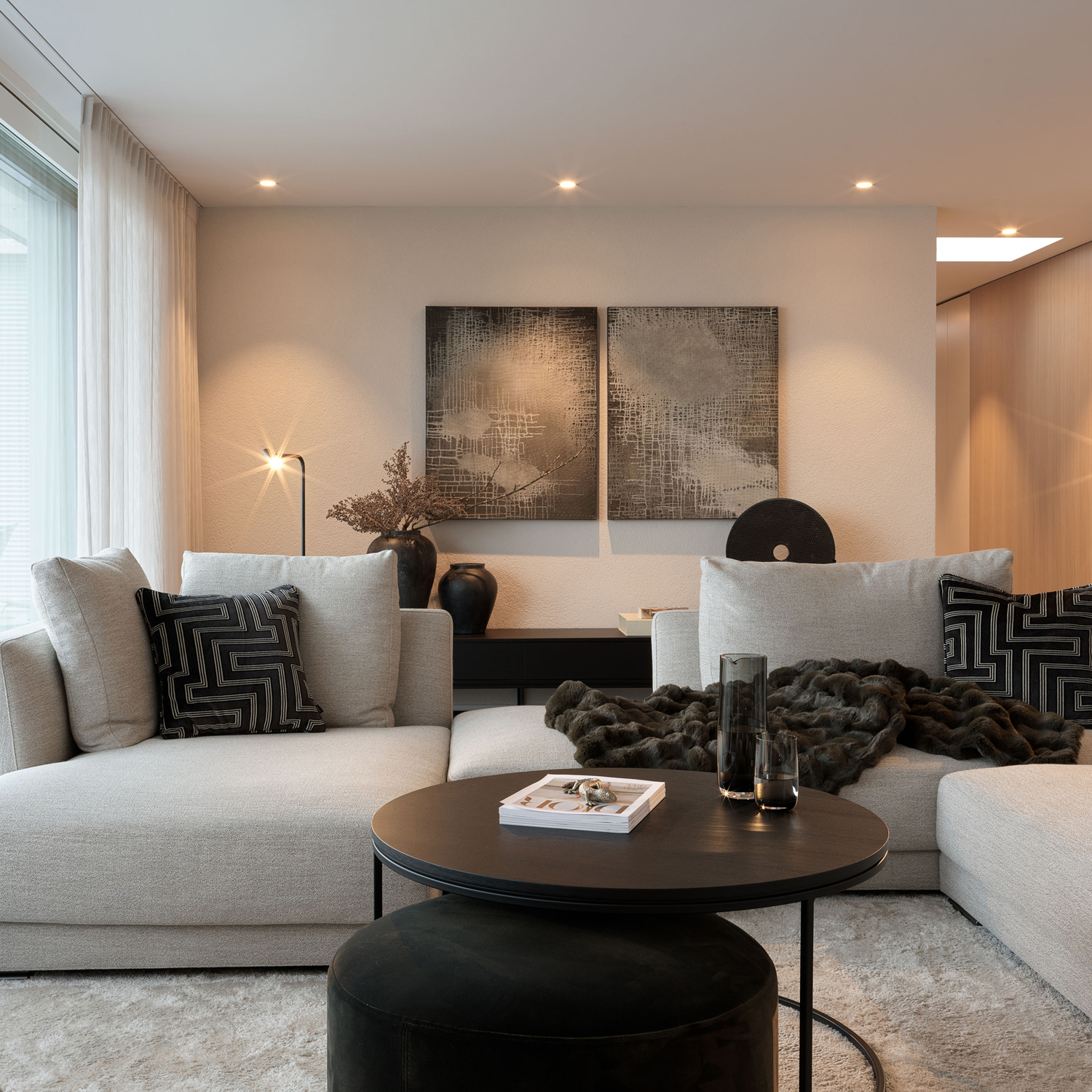
Loud colours are bright colours. Such colours have a high saturation and are usually very bright. Examples of bright colours are pink, bright red, bright yellow or bright turquoise. These colours immediately attract attention and are often used in fashion, advertising or design to achieve strong visual effects. Quiet colours are muted colours. Muted colours are usually less saturated and can be created by adding grey, black or white. Examples of muted colours are beige, taupe, olive green, grey-blue or burgundy red. Such colours are often used in interior design to create an elegant, classic or calming atmosphere.


TIP
Bright colours in interior design should be used deliberately and carefully to create strong visual accents without overpowering the room. Here are some suggestions on where and how bright colours can be used effectively:
Accent walls: A single wall in a bright colour can make a room dynamic and interesting without dominating it.
Pieces of furniture: An eye-catching sofa, armchair or chest of drawers in a bright colour can serve as an eye-catcher and give the room character.
Decorative accessories: Cushions, carpets, curtains, artwork or lamps in bright colours can add splashes of colour and make the room look lively.
It is important that the bright colours are combined with neutral or muted colours to create a balanced and harmonious overall look. Too many bright colours can quickly become overwhelming, so they should be used sparingly and deliberately.

RELAXING AND CREATIVE COLOURS
It is generally assumed that cold colours are calming. They are said to reduce blood pressure and pulse, which leads to faster relaxation. However, it has also been found that pale colours (watery and bright) are particularly relaxing. There is even the ‘Baker Miller pink’ colour that is used in prison cells to calm down particularly unruly inmates – there are even ‘Barbie rooms’ in the high security wing in Bern.
Perhaps the trend towards rose and pink in interior design is due to the rather aggressive global times? The relaxing colours also include peach. Pantone has proclaimed ‘Peach-Fuzz‘ as the colour of the year this year!
TIP
Particular attention should be paid to lower temperatures in the bedroom (improves the quality of sleep) and cooler colours are the best recommendation here. In addition, blue to turquoise colours strengthen the vegetative nervous system, which leads to noticeable physical relaxation – just think of a walk in the woods or a view of the sea!
Dark blue encourages us to contemplate and thus promotes calm and relaxation. It lends depth and mysticism and allows us to communicate better with our inner being during sleep.

GREIGE AND ‘SAD BEIGE’
Greige (pronounced ‘gräsch’), the mixture of grey and beige, is a peaceful basic tone that adds harmony to any room. Its soft, velvety appearance allows walls to fade into the background and softens contrasts in the room.
There is a lot of excitement on social media at the moment, as ‘sad beige‘ has gained a reputation for being boring and sad. This certainly applies to rooms such as children’s rooms, for example, where bright colours (toys etc.) are intended to stimulate cognitive thinking.
However, a nice mixture of beige and grey and the use of contrasts always looks elegant, timeless, tidy and harmonious.

TIP
The term ‘sad beige‘ is used when the basic colours are used in such a way that the room is furnished ‘tone-on-tone‘ (colour to colour). In concrete terms, this means that all the colours, including the furnishings, are in the same colour spectrum – I like to call it ‘mash’ or ‘mushy’. To make an environment look lively, you need contrasts – just like in life. A dark contrast through furniture or furnishings is like the salt in the soup and adds flavour to the home…
MY SECRET TIPS:
Changing spatial perception with colours? It works!
The darker a wall is painted, the closer it appears. This also means that the spatial experience can change completely, namely from wide and airy to dense and cosy.
This makes particular sense if rooms feel ‘too big’ or if the quality of the space is to be improved in the direction of more relaxation and contemplation.
In keeping with the times, walls are no longer painted white, but are given a matching base colour such as eggshell, sand or greige. The rooms still feel fresh and bright, but radiate a gentle warmth. If door frames, doors and high plinths are left lighter in colour than the walls, the result is a timeless vibrancy. Ceiling colours are currently in vogue – why does a ceiling always have to be white? Ceilings in the same colour as the walls create an intuitive cave-like feeling (and we humans originally come from caves). The feeling of space becomes even more intense if the ceilings are painted a darker colour than the walls – you literally create a roof over your head ( shelter ).

Nicole’s blog appears sporadically and brings you useful tips for your personal feel-good world, the latest products and interesting facts as well as scientific information from the day-to-day work of an interior designer.
Would you like to receive the latest blog? Then follow us on our social media channels.
Nicole Gottschall
Head of Design GO INTERIORS
Interior architect VSI.ASAI / Owner
Copyright NICOLE GOTTSCHALL
Published July 24 / GO INTERIORS GmbH
www.go-interiors.ch


